
Essential Bills
An app for good people to financially support others
My Roles:
UX • UI • Branding • Strategy
Type:
Freelance Project
Project Overview
The misson
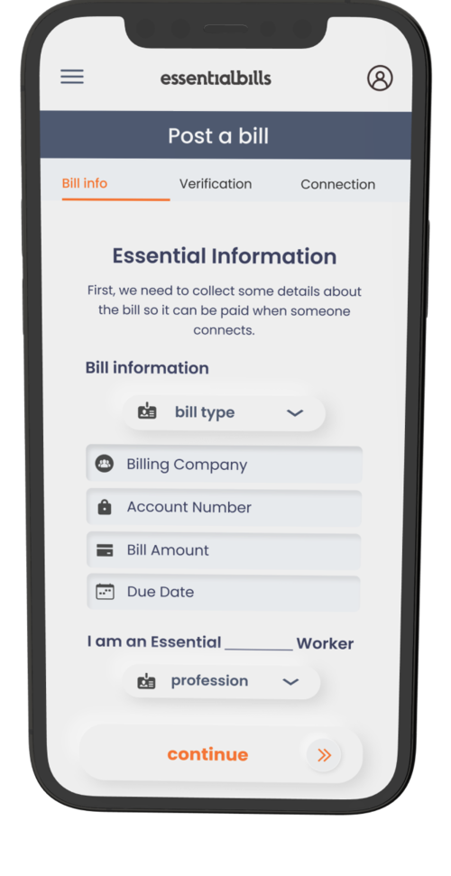
I was asked by a venture studio to design the UI and UX for a mobile website they were launching to support people with overdue “essential” bills such as water, electricity, or gas. The goal was to give people going through a hard time a helping hand. A good samaritan could, with a click of the app and a modest donation, prevent someone from becoming homeless. I loved the companies’ mission so I took the project on!
The outcome
For many weeks I iterated, prototyped, and user-tested with Figma and Sketch wireframes. In the end, I developed a UI and UX that I believe is both comprehensive and intuitive. The website is currently in development!
Style Guide
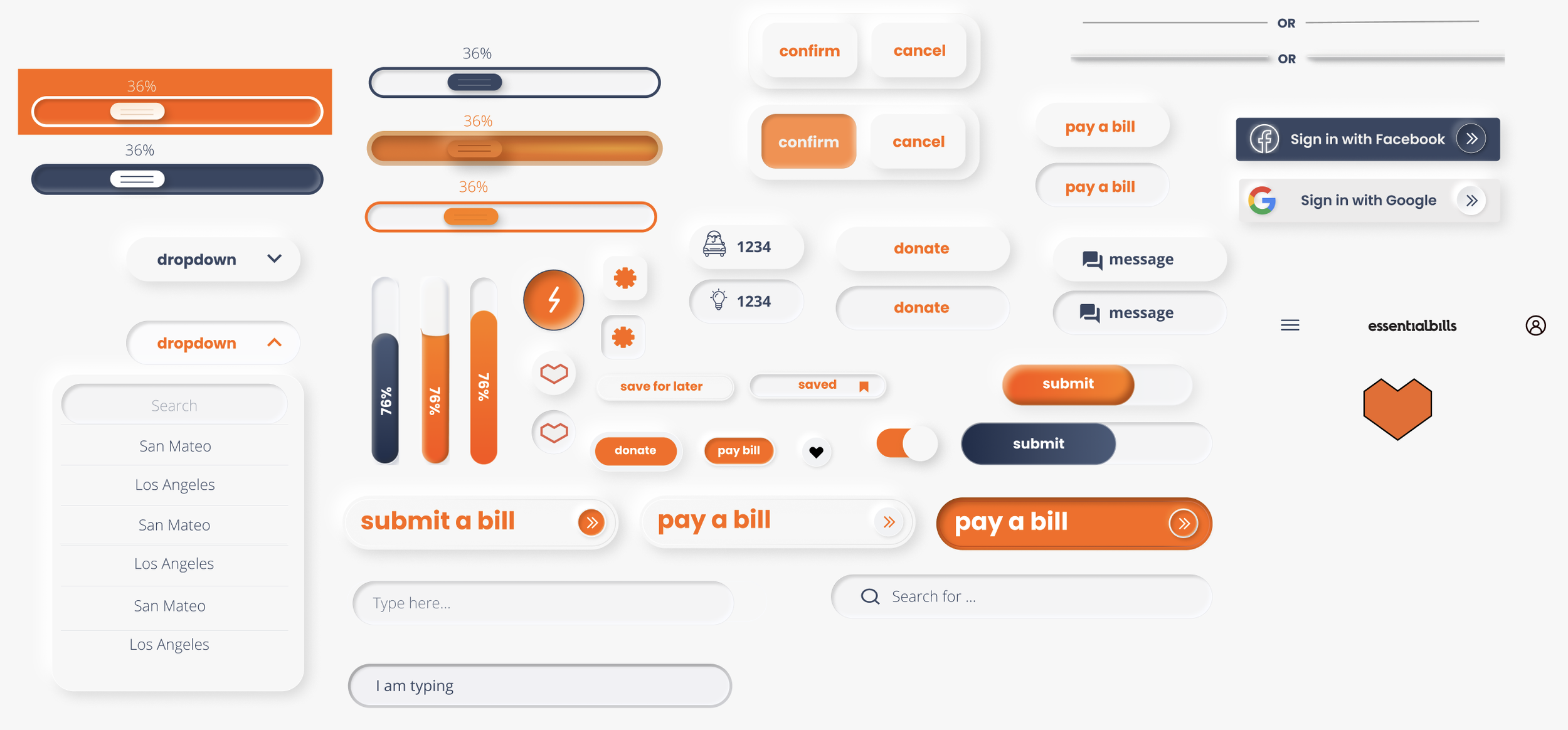
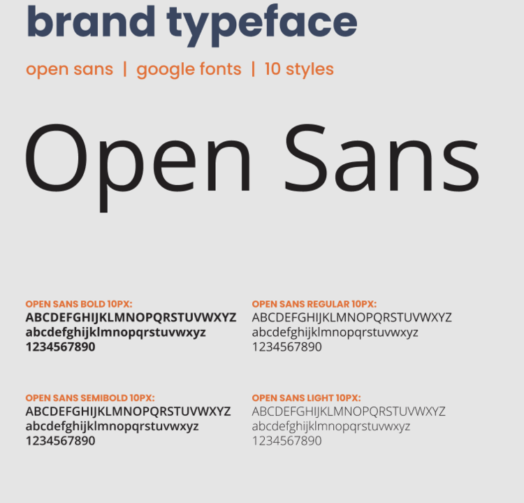
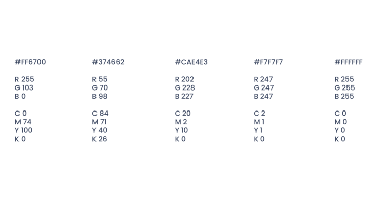
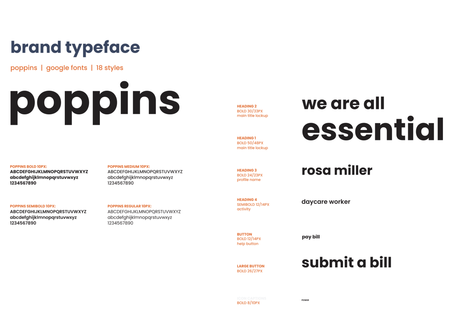
I was told to start by creating a comprehensive Skeuomorphic component sheet to standardize the UI, across the app. Because I did it entirely from scratch, I learned a lot about shading in UI. I also standardized font and the colors.
Ideation & Wireframes
My first pitch to the venture studio was a crowdsourcing platform in which donors can pay $5 of someone's bill just by swiping right on them. This swiping mechanism allowed for casual micro-donations that can help make a difference while still being accessible to donors who may not have the money to pay for an individual's entire bill. They could filter by labels such as income, distance, and bill type to customize their feed.
When speaking with venture studio lead about my proposal, he said he would prefer something more personal that would foster a closer relationship between the donors and the donee. I took this information and went back to the drawing board.

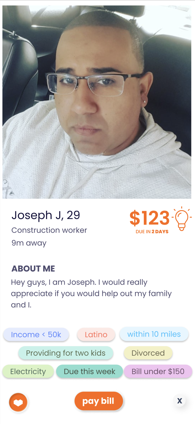
I tried to increase the personal connection more with 3 changes:
1. Instead of just posting a photo, the donee records a video introducing themselves when they post the bill. This allows for more verification and human connection.
2. The donor pays for the entire donee's bill. In lieu of this change, I thought a Tinder-swiping mechanism was not fitting because paying for a $150 bill with a right swipe seems absurd. I thought a TikTok scroll mechanism would be a great way to browse freely to search for the perfect recipient of the donation.
3. The donee and donor would be prompted to start a chat immediately after the bill has been paid.

I started ideating on all of the potential wireframes needed and all the potential user flows!



Home screen options
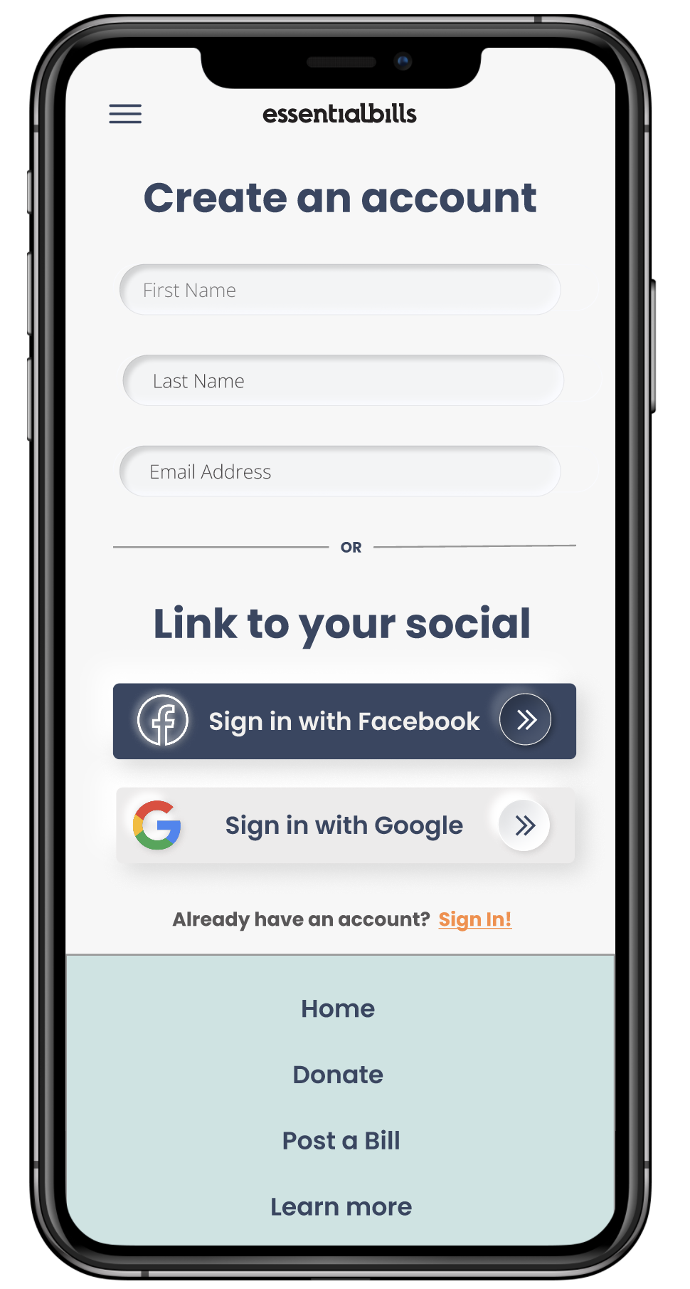
The app has a customized menu and homepage for users based on whether they are primarily interested in paying someone's bill or getting their bill paid.
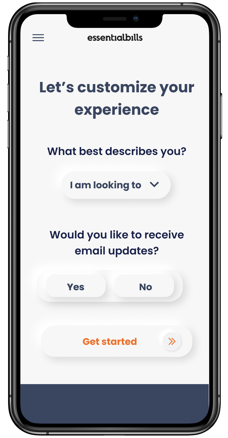
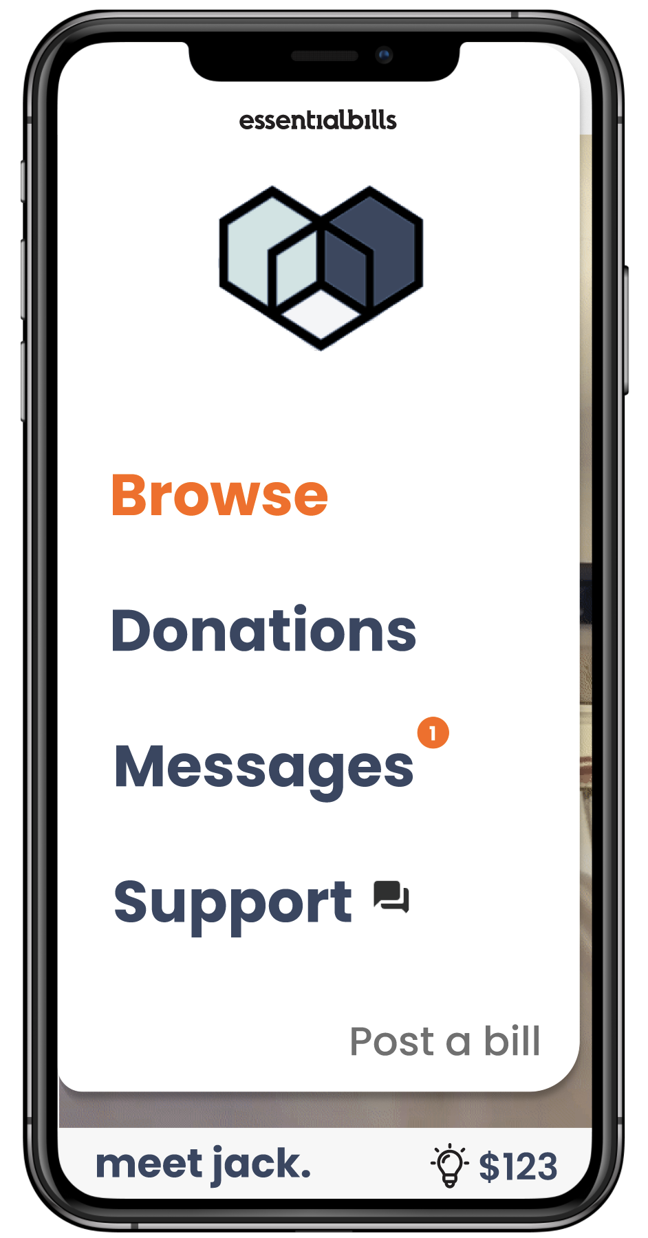

Custom menu based on onboarding and app usage
In the donee workflow, the individual posts bill information and verification (when the bill gets paid, it goes directly to the billing company so there is no ability to scam), signs in, posts their bill, and then can view their bill from the Bill Management page.
In the donor workflow, the individual browses for someone whose story they connect with, chooses to pay the bill, signs in, and then can view previous donations from the Donation Management page.
I sketched out low fidelity mockups for each wireframe (almost 40) and built them in Figma.
I still did not know which wireframe have a good idea for the home screen though. My goal was to get users invested in the app as quickly as possible and hopefully pay someone's bill. I decided to start the user off with option #4 because it didn't require any clicks for the user to start hearing others' stories.
After coming up with a fleshed out design, I tested it with 30 friends and family using a prototype testing tool called Usertool. I gave each participant 10 tasks and asked them to complete it as quickly as possible. The data and responses showed that the user flow was very intuitive and the only complaints were about some of the copy on the "Record a Video" page.
As I tested the app more, I came to the realization that the video upload feature has potential to be inequitable. For example, people who do not speak fluent English may have a more difficult time telling their story and getting their bill paid. I had lengthy discussions with the Venture Studio about adding features to improve accessibility such as adding translated captions for Spanish speakers and the ability for people to type an introduction rather than record a video. They were very interested but did not feel these features were necessary for the MVP.
While the final product is being developed…check out my prototype
What did I learn?
1. User flow mapping
Through a lot of testing, I developed every wireframe needed in the user flow, which amounted to over 40 pages. This application is particularly complicated and, prior to this project, I had not developed with such an extensive set of user flows with multiple user types.
2. How to adapt to other people's style choices and visions
When I was asked to design the app using a Skeuomorphic design, I was a bit worried as I had not had any experience designing with that style and I was not particularly in love with the style choice. I learned to adapt and build something that I am proud of.
3. User testing software
I learned how to use user testing software (Usertool) to better pinpoints areas of confusion. Though it was my first time using the software, I am sure it will not be my last!